|
<< Click to Display Table of Contents >> Editing the Chart Axes |
  
|
|
<< Click to Display Table of Contents >> Editing the Chart Axes |
  
|
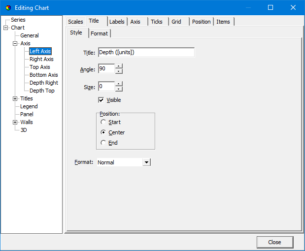
The axes can be formatted using the Axis sub-section. When this sub-section is expanded each axis can be selected for formatting. The Depth Right and Depth Top axes are used for 3D charts. Several tabs control the format of the each axis and are described briefly below.

The following are some of the most pertinent items that can be edited:
Scales Tab
Automatic: Check this to automatically calculate the axis minimum and maximum values based on the data.
Visible: Check this to show the axis on the chart.
Title Tab
Title: This is the title to show for the axis. If the text contains [units], the data units will be substituted.
Angle: This is the angle of title relative to the horizontal.
Position: This is the position of the title along the axis.
Font: This is used to set the font for the axis title.
Labels Tab
Visible: Check this to show the tick labels on the axis.
Angle: This is the angle of tick labels relative to the horizontal.
Min. Separation %: This is used to specify the minimum separation between labels. A value between 20 and 40% is recommended.
Font: This is used to set the font for the tick labels.
Ticks Tab
Outer Visible: Check this to show ticks at the labels.
Outer Length: This is used to specify the length of the ticks used for the labels.
Outer Color: This is used to select the color of the ticks used for the labels,
Minor Visible: Check this to show minor ticks between labels.
Minor Length: This is used to specify the length of the minor ticks.
Minor Color: This is used to select the color of the minor ticks.
Grid Tab
Visible: Check this to show the grid related to the axis.
Color: This is used to select the color of the grid lines,
Style: This is used to select the style of the grid lines.